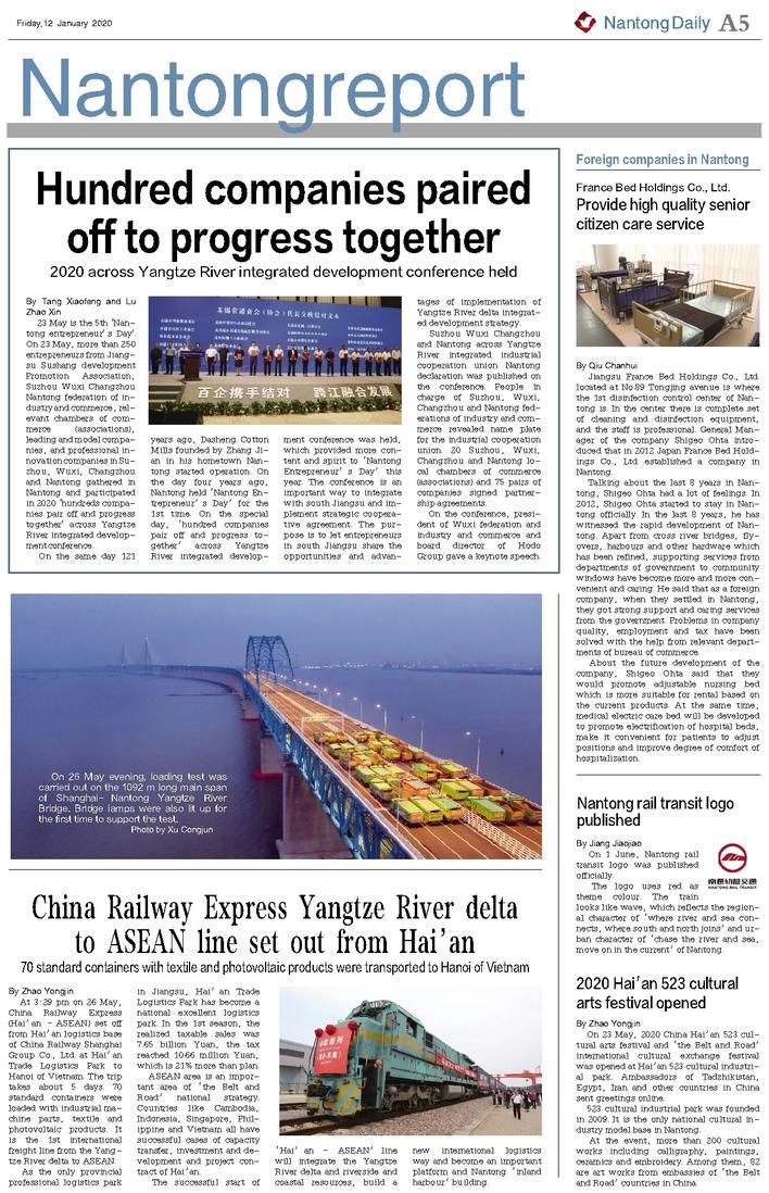

By Jiang Jiaojiao
On 1 June, Nantong rail transit logo was published officially.
The logo uses red as theme colour. The train looks like wave, which reflects the regional character of ‘where river and sea connects, where south and north joins’ and urban character of ‘chase the river and sea, move on in the current’ of Nantong.